Lesson 13: Letter Kaaf
Letter Kaaf
Introduction
In this lesson, you will learn how to write the Arabic letter Kaaf using the Thuluth calligraphy style.
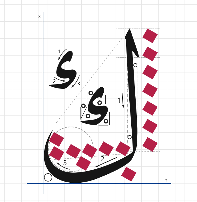
Kaaf is a strong and upright letter, distinguished by its tall vertical body and firm baseline extension. Writing Kaaf helps students develop control over long vertical strokes, baseline balance, and precise inner shaping, all of which are essential technical skills in advanced Thuluth calligraphy.
Letter Data
- Letter: Kaaf
- Script: Thuluth
- Shape: 1
- Total strokes: 3
- Pen angle: 75°
- Total length: Based on nuqta measurements
Stroke Details
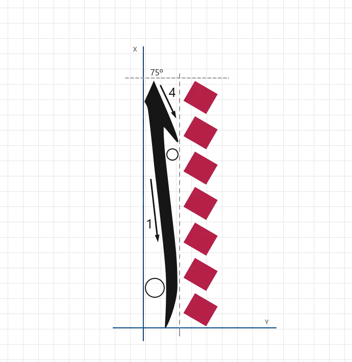
Stroke 1:
- angle: 75°
- direction: Downward vertical
- length: 7 nuqtas (height)
- width: Pen width (standard nib width)
- pressure: Firm and steady
- description: Draw a tall vertical stroke to form the main backbone of the Kaaf, giving the letter its strong and commanding presence.
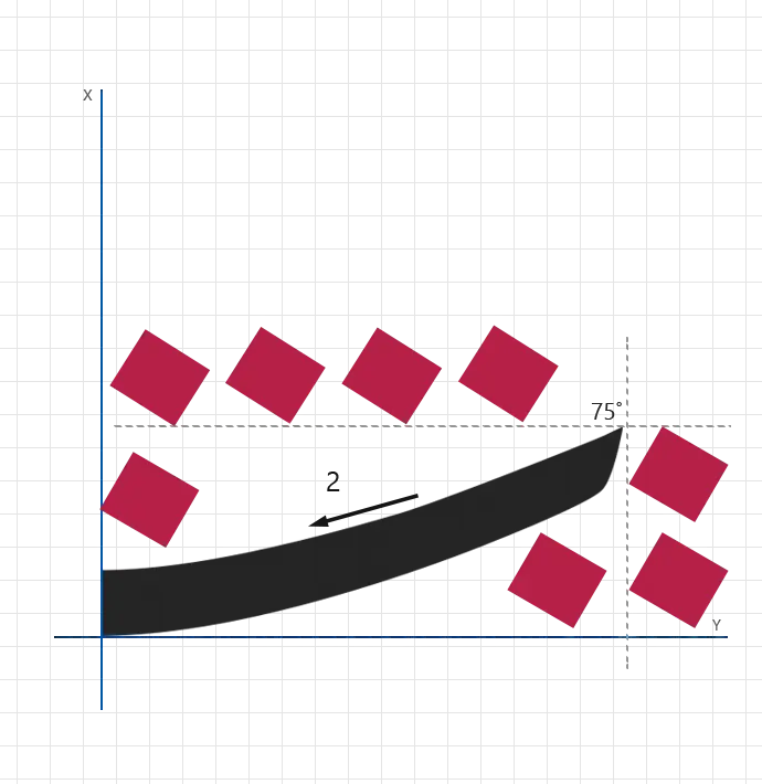
Stroke 2:
- angle: 75°
- direction: Horizontal extending forward
- length: 4 nuqtas (width)
- height: 2 nuqtas
- pressure: Medium and controlled
- description: Draw a horizontal stroke from the lower part of the first stroke to establish balance and structural stability.
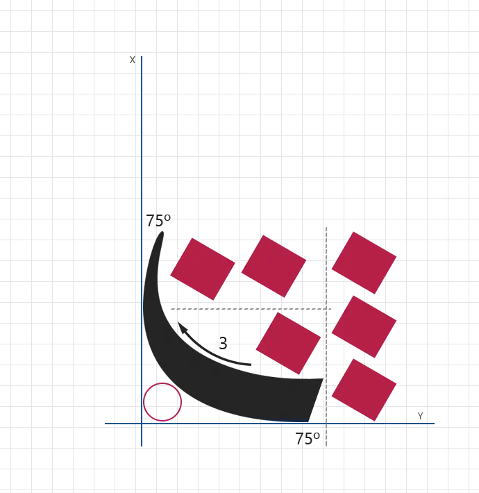
Stroke 3:
- angle: 75°
- direction: Downward vertical
- length: 3 nuqtas (height)
- width: 2 nuqtas
- pressure: Medium
- description: Draw a shorter vertical stroke to refine the letter’s form and complete the Kaaf with visual clarity and proportion.
- Main vertical backbone
- Base horizontal stroke
- Final vertical refinement stroke
- First stroke too short or leaning incorrectly
- Weak horizontal base connection
- Third stroke too thick or misaligned
- Inconsistent pen angle
- Poor proportion between height and width
Practice the first vertical stroke alone until its height consistently reaches 7 nuqtas. This stroke controls the visual strength of the entire letter.
Structured Practice Guidelines for Letter Mastery
The "Guidelines for Letter Mastery" table provides a clear and systematic approach for students to practice and refine their Arabic calligraphy skills. It outlines each step, the recommended time allocation, and detailed descriptions to ensure effective and focused practice sessions. This table is designed to help students build consistency, master letter proportions, and develop a strong foundation in Arabic calligraphy.
| Step | Time | Description |
|---|---|---|
| Set Aside Dedicated Practice Time | 15–20 minutes per session | Allocate focused time for practice. Aim for 3–4 sessions per week to build consistency and muscle memory. |
| Understand the Letter's Structure | 2–3 minutes | Review examples and stroke breakdowns. Familiarize yourself with angles, proportions, and key components. |
| Begin with Tracing | 5–7 minutes | Trace the letter on the worksheet to understand its flow and stroke angles. |
| Practice Freehand | 10–12 minutes | Draw the letter freehand using guides. Focus on clean strokes, proportions, and consistency. |
| Refine with Repetition | 5–10 minutes | Repeat the letter multiple times, aiming to improve alignment, spacing, and smoothness. |
| Evaluate Your Progress | 2–3 minutes | Compare your work to the examples on the worksheet. Identify areas for improvement. |
| Incorporate Feedback | As needed | Seek feedback from an instructor or peer and apply their suggestions in future sessions. |
This lesson teaches the multi-stroke structure of Kaaf and how to combine its parts smoothly.
There are no comments for now.
to be the first to leave a comment.